
After the overwhelming response I got from my previous cinematography breakdown (see the Prisoners breakdown HERE) I've decided to dedicate another week of my life to creating a new one. It's really nice to know that people appreciate what I share here at the blog! When I started work on the Prisoners breakdown, I was not expecting it to be so well received and I'm really glad to read that it has been insightful for many :)
Since that post, I have received a lot of requests to break down other films, but the thing is, I have to be REALLY inspired by the cinematography to the point where I can't stop thinking about how it was done, and that doesn't happen often! Sometimes, it might only be a single scene, or in this case, an entire chapter that gets me going. So, after re-watching Inglourious Basterds, I got THAT inspired. Something which has also happened with some episodes of Game Of Thrones and almost all of True Detective, but that's for another post :) The lighting and set design throughout Chapter 1 of Inglourious Basterds, really hit me. I also like how well cinematographer Robert Richardson has used the seemingly small space of the cabin so effectively. One of my new favorite cinematographers for sure, Mr. Richardson, you're amazing! :)
I've made this breakdown a little differently than the last, in a way that I think will be more useful. Mostly, I've just tried to clean it up a bit so that you can actually see the shot. I've included a Vector Scope and Wave Form Monitor which show actual chroma and luma levels from the DVD release. I also took the colour palette a step further by adding the brightest and darkest values either side, showing how they compare to a black and white clip point. I found this stuff fascinating :)
Before you read on though, please know that:
1). I had nothing to do with the making of this film and don't really know for sure how things were done. Some information, like the lenses used (Cooke Anamorphic) and Film Stocks used (35 mm Kodak Vision2 200T 5217 & Vision3 500T 5219) were taken from IMDB.
*EDIT Turns out I didn't read the IMDB info closely enough, since other readers have since pointed out that Spherical lenses were also used on this film. So, unless you see obvious characteristics of Anamorphic, my lens guess my well be half of what I says it is ;)
2). The following notes are of shots that I have chosen from chapter 1 - In other words, I have not frame-grabbed every single shot. I have only selected frames that I felt deserved a closer look. These are my observations only and should not be taken as fact. When I look at an image, I study it and come up with reasons as to why I like it, or why I think it works...this is how I train my eye to look at every day life. I practice this way of thinking so that I can confidently make creative and technically sound decisions on set as a working cinematographer. These slides are my analytical thoughts, graphically designed and packaged for quick digestion.
3). If you notice something that I don't, or disagree with any of my notes, please feel free to comment! Also remember that this is a friendly place, for friendly people.
Okay, so with that out of the way lets take a look at the colour palette that makes up the outdoor stuff, and compare that to the indoor stuff :) I love this stuff!
Showing the general colours of a scene is great, but it's also interesting to see that a "true" or 100% black point doesn't exist in many of these shots, and the same goes for a white point. In fact, I was shocked to notice that the outdoor scenes have a lower white point than the indoor scenes! Very interesting :) It's also nice to look at saturation and luminance levels on an actual scope, at least, these are the values I monitored when looking at my DVD copy.
Something I try to make clear on a regular basis is that cinematography is only a part of the many pieces that make up a film. Lighting, blocking and framing aside, colour and set design are obviously a big part of what we need to pay attention to, and here you can see a very specific pallet has been chosen for this film. From scene to scene there are different splashes here and there, but overall, shadows are warm and highlights cool - often, it's the other way around. Regardless, I absolutely love how colour was handled in this film.
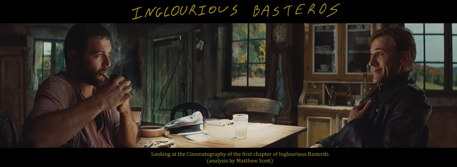
The pace of the first chapter is so perfect and the tension that Tarantino builds is almost traumatizing! To hit that sort of perfection you need amazing actors - Denis Menochet and Christoph Waltz bring so much to the story, far beyond, I believe, the genius words that Tarantino placed in front of them. The music and sound design I've left till last, because it is as equally impressive and fitting. A quick Google search revealed Joe Bard's in depth sound anazlysis, which I hope he doesn't mind me sharing here :) Nice work man!
Finally, I know there are many other films out there that have been acclaimed to have amazing cinematography, but we all have our own taste, right? I mentioned in the previous breakdown that I love the simplistic and masterful approach that Deakin's employs with his work. The camera isn't moving unless it helps the story. Light is added or subtracted just enough, and motivated by the environment. Everything is done SO well that you barely notice it at all, unless you look for it. That's what I'm talking about, and this chapter is FULL of perfection in my opinion. Many of the frames look like beautiful paintings rather than photographs. The balance, depth and attention to detail of the work below is just gorgeous. Robert Richardson is a master!
Alright, enough waffling, let's take a look!
So that took me a loooong time....reminded me of high-school actually, having to finish some project hehe. The difference here is, I'm actually learning too, and it's great to be able to share with others what I'm thinking. Like I've said before, don't bet that any of this info is actually accurate, it's literally just my analysis - a detailed brain fart. If it was an enjoyable read, great :) If it was helpful or inspiring, awesome! Even if you got ONE thing out of it, then I'm happy :) Thanks for stopping by!
P.S. There is no magical program that can create what I have created above.
To rip a DVD (it's legal to create a copy of a DVD that you own, for backup purposes) you can download a FREE program called "DVD Shrink", just google that. From there you can scrub through the ripped .VOB file directly on EDIUS's timeline. From THERE I just ctrl+print screened the grabs and then pasted them into Photoshop (along with the scopes). I then used the eye dropper in Photoshop to select colours from the scene and created the strips using the paint bucket. Spelling errors and grammar are the least of my concern ;) PEACE!
